Look at the cut piece, not just the fabric
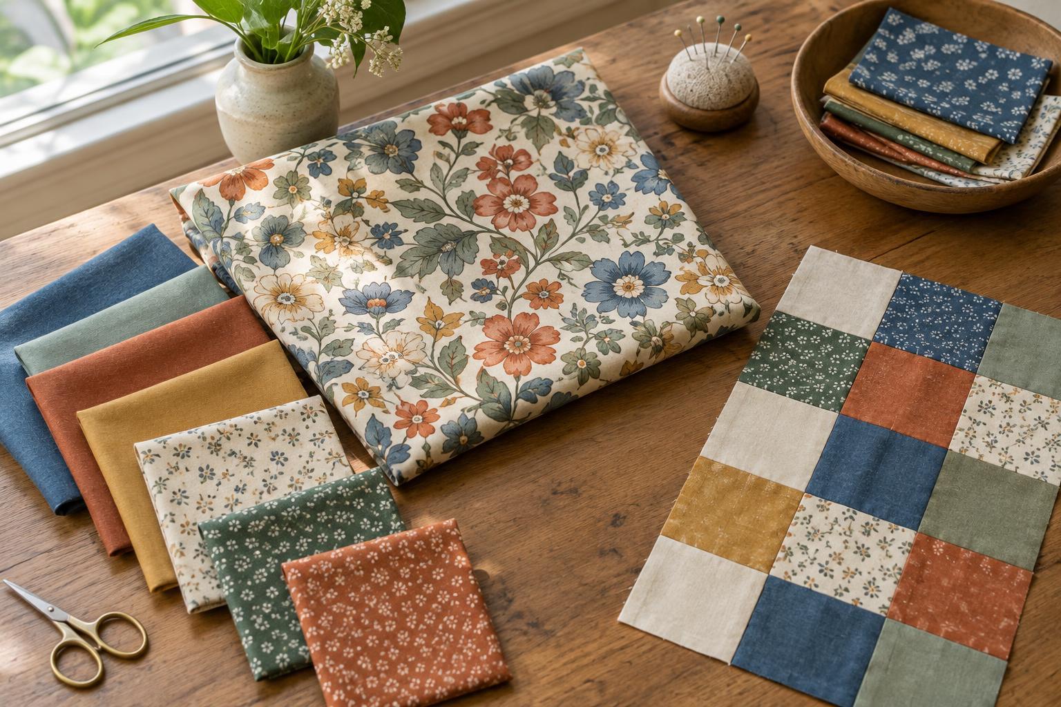
A print that looks balanced across a folded length of fabric may look quite different inside a two-inch square. Cutting reveals only a portion of each motif, and seams hide a little more. The useful question is not simply whether a fabric has a small or large print, but what will remain visible in the finished piece.
Small prints often read as texture from a distance. Dots, tiny flowers and closely spaced marks can give a patchwork piece a fairly even appearance. Medium prints tend to show recognizable shapes in moderately sized pieces. Large prints need more room to display a complete motif, though a cropped fragment can be attractive in its own right. These are working descriptions rather than fixed categories: the size of the cut piece determines how a print behaves.
Match the print to the job of each piece
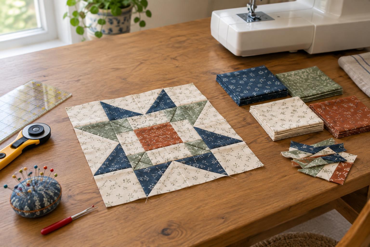
Start by identifying what each patchwork piece needs to do. A narrow strip or small triangle may need to make the edge of a star, path or other shape easy to see. A small-scale print or fabric that reads almost solid can help that shape stay clear. If several bold motifs land in those little pieces, the eye may notice the motifs before it sees the block design.
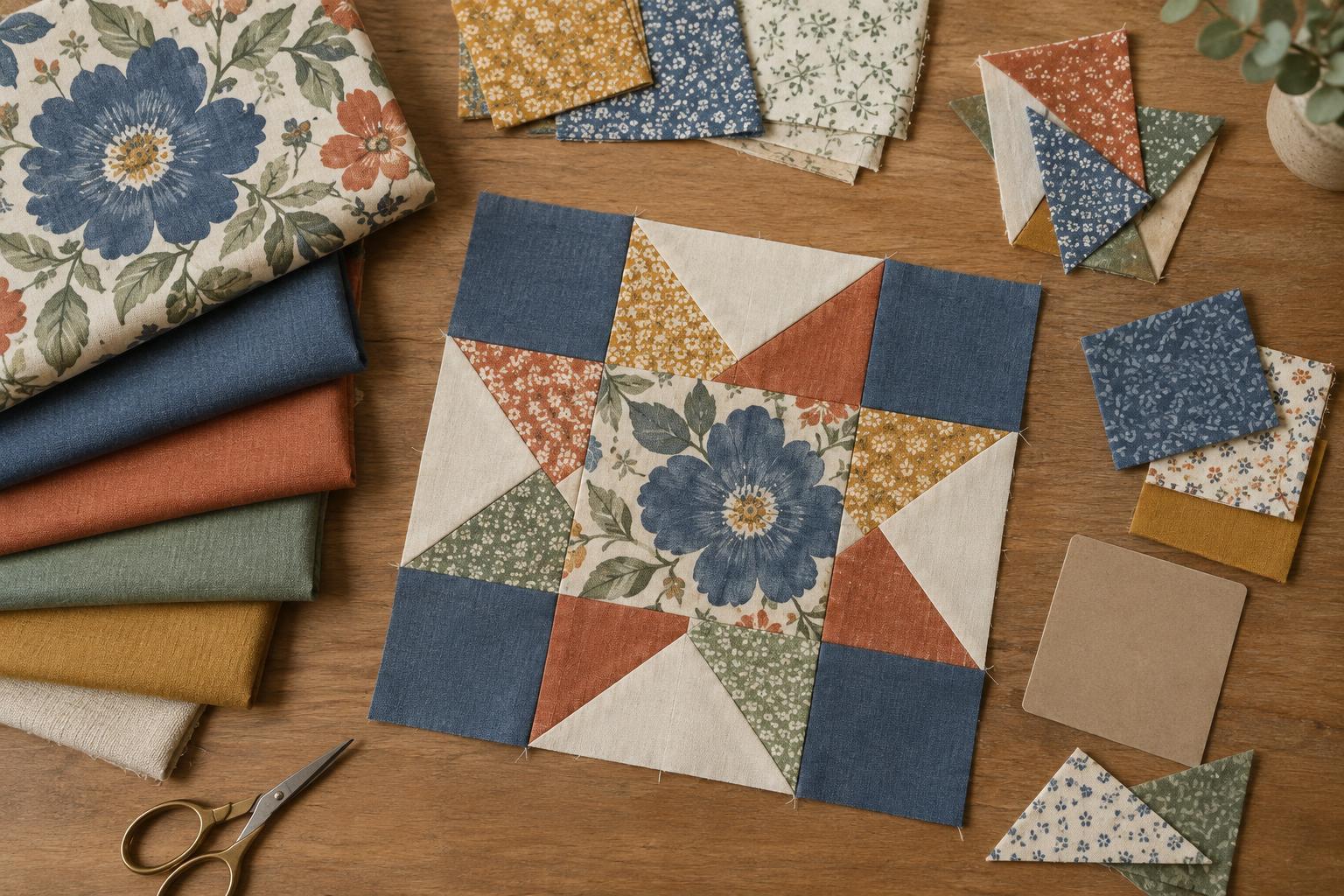
Larger squares, wide borders and generous background areas give a spacious print room to unfold. They can also carry a partly cropped motif without making it look accidental. Try a large floral in an open square, for example, while using quieter prints in the smaller pieces around it. This creates a place for the eye to rest as well as a place to look.
There is no rule that small pieces must contain small prints. A large-scale print cut into many little pieces can create lively, varied fragments. Choose that effect deliberately, especially if the pattern depends on a crisp outline. You can keep the outline readable by giving neighbouring pieces enough contrast in overall lightness or darkness.
Check colour and value alongside scale
Print scale is only part of what makes a block legible. Two fabrics can have different motif sizes yet blend together if they appear equally light from a few steps away. Conversely, a small busy print can act as a dark fabric when its marks are densely packed. Before committing to a combination, arrange a few cut-size samples in the order they will appear in the block and step back.
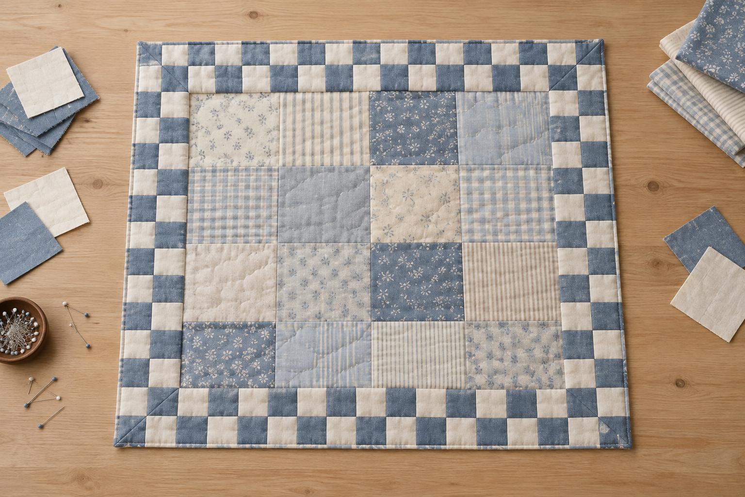
Squinting at the samples can help you see their broad areas of light and dark rather than individual details. Ask whether the intended shape still stands out. If it disappears, changing one fabric’s value may help more than changing its print scale. You can also repeat a colour across prints of different sizes to make a varied group feel connected.
Be alert to strong stripes, checks or directional motifs. In small pieces, their lines may become more prominent than their colours. That can be useful when you want movement, but it may call attention to pieces that are cut or rotated differently. Decide whether consistent direction matters to your design before cutting all the shapes.
Audition prints at their finished size
A simple paper window can make fabric selection easier. Cut an opening roughly the size and shape of the finished patchwork piece, then move it over a candidate fabric. It will show which motifs might appear and how often they change across the cloth. For greater accuracy, account for the seam allowance when planning where to cut: the fabric inside the seam may not be visible after assembly.
Test more than one position on a large print. One square might contain an entire flower, another just its edge, and a third mostly background. If you want a particular motif centred, plan the placement before cutting and allow for the extra fabric that selective cutting can use. If you prefer variety, cut normally and let different fragments appear throughout the quilt.
For a repeated block, make one sample before cutting every piece. View it up close and from across the room. A print that seems overwhelming on the cutting table may settle comfortably into the full block; one that seemed subtle may compete with an important seam line.
Build a useful mix
A practical starting point is to give prints different roles: a few quiet fabrics to support the block structure, some medium-scale prints for interest, and a larger print where there is space to enjoy it. The proportions can change with your goal. A calm quilt may use mostly small or low-contrast prints, while a playful scrap quilt may welcome frequent shifts in scale.
As you plan, place the actual fabrics next to each other rather than judging each one alone. Check the smallest piece, the largest piece and the joins between them. If the design reads clearly and you like the rhythm of quiet and busy areas, the mix is doing its job. Print scale is a tool for shaping what viewers notice, not a rule to follow at the expense of a quilt you enjoy making.