Start with the fabric, not a shopping list
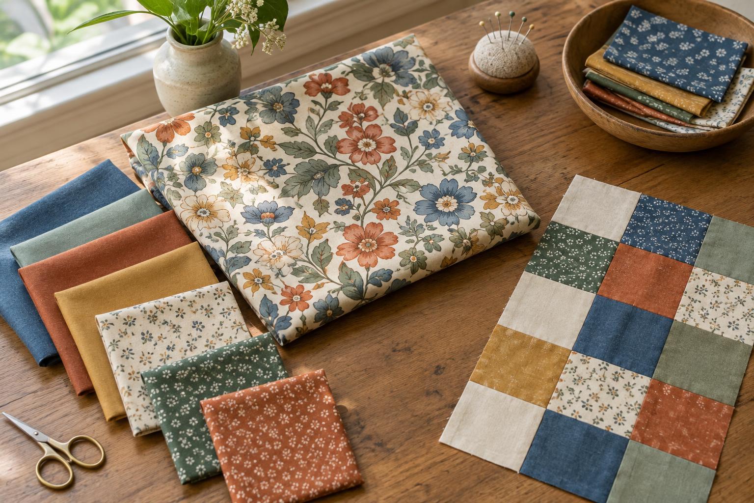
A favourite print can give you a starting point for a quilt, especially when choosing fabrics from scratch feels overwhelming. Set the inspiration fabric on a table and look at it from a few steps away. Which colours do you notice first? Which appear only in small details? The colours that dominate at a distance may be more useful for planning than every shade you can spot up close.
Decide how prominently you want this fabric to appear. It could feature in large squares, repeat as a narrow accent or serve only as a reference while you select other fabrics. You do not have to include it in the finished quilt. Some prints are easier to build a palette around than to place in a particular block.
Choose a limited set of working colours
Pick two or three colours from the inspiration fabric as the main palette, then consider one quieter colour for open space or contrast. A colour does not have to match the print exactly: a slightly softer or deeper version may sit comfortably alongside it. Pull fabrics you already own before adding anything new, and keep the first selection small enough to compare easily.
Give each colour a job. One might cover broad areas, another might connect several blocks and a third might appear sparingly to draw the eye. If every colour takes up the same amount of space, the design may feel busier than you intended. Unequal proportions can make a varied palette easier to read without removing the variety you enjoy.
Audition fabrics for their roles in the quilt
Lay your candidates beside the inspiration fabric, then check them against one another. A fabric can match the starting print beautifully yet blend into its neighbour when both are cut into small pieces. Try arranging the fabrics in rough groups for backgrounds, main shapes and accents. View them at the distance from which you expect to see the quilt, as well as close up.
Consider how much visual detail each fabric carries. A lively print may be effective in a large, simple shape, while a quieter fabric can give the eye somewhere to rest. If two busy prints compete, you might separate them with a calmer one or assign them to different parts of the layout. These are choices to test, not rules that every quilt must follow.
Take a photograph of the arrangement if that helps you compare options, but make the final decision with the actual fabrics in front of you. Screen appearance can change with lighting and display settings. Move one fabric out at a time and ask whether the remaining group feels clearer; this is often more revealing than adding more possibilities.
Make a small layout before committing
Before cutting the whole project, sketch a few blocks or arrange fabric pieces in the approximate shapes your pattern will use. A narrow strip shows less of a large print than a generous square, so the same fabric can have a different effect once cut. If you plan to use the inspiration fabric in multiple places, check that its visible motifs work at each intended size.
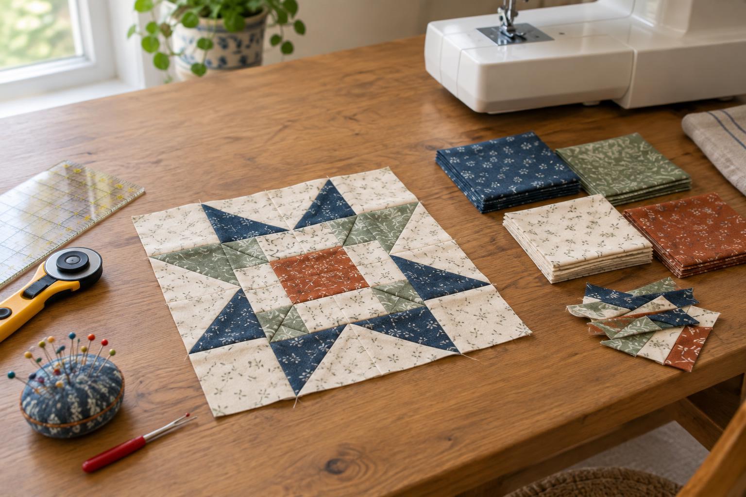
Try a sample block or a small arrangement of cut pieces using your likely background, main fabrics and accent. You are checking the relationships between them, not trying to produce a perfect miniature quilt. If a colour disappears, give it a different neighbour or a larger area. If an accent feels too forceful, use less of it before replacing it altogether.
Palette planning is one way to organise a creative idea. For a detour into how another craft develops structure, browse Screenwriting · Nightfire Film Journal; then return to your fabric layout and decide which part of your quilt you want viewers to notice first.
Keep the plan flexible as you sew
Set aside a small labelled group of your chosen fabrics or make a simple note of their intended roles. This gives you a reference when you begin cutting and helps if you pause the project. It also leaves room for substitutions: a fabric may prove too dominant in repeated blocks, or a quiet choice may need more space to make an impact.
Return to the inspiration fabric when you feel unsure, but do not treat it as a strict colour chart. A useful palette is one that works across the whole quilt, including the spaces between its most noticeable pieces. Once you have tested the colours in real block shapes, you can sew with a clearer plan and adjust it as the design develops.