What value means in a quilt
Fabric value describes how light or dark a fabric appears, regardless of its colour. A pale blue and a pale yellow may play similar roles in a block, while a deep blue and a deep red may both read as dark. Colour gives a quilt its mood, but value helps the eye distinguish one shape from another.
Think of light, medium and dark as roles rather than fixed labels. A fabric that looks dark beside cream may look medium beside navy. The useful question is not simply “Is this fabric dark?” but “Is it different enough from the fabric next to it to show the shape I want?”
How contrast reveals the block
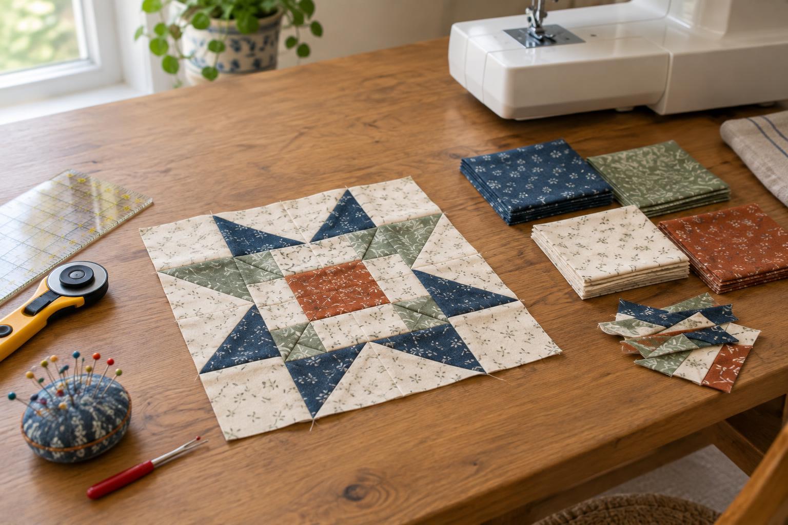
Many patchwork designs depend on the viewer seeing edges between pieces. In a star block, for example, light points against a dark background are easy to pick out. If the points and background have similar values, the star may fade even when the fabrics are different colours. That can be a pleasing effect, but it should be a choice rather than a surprise.
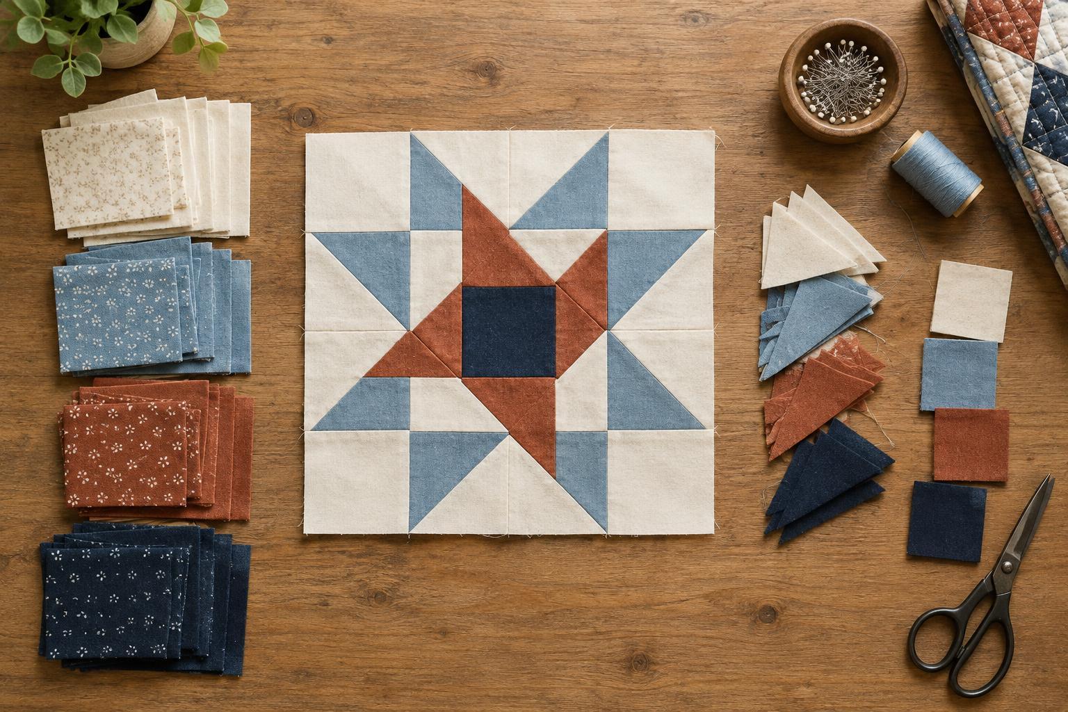
Start by deciding what the block should show first. It might be a star, a diagonal chain or a central square. Give that feature a value that stands apart from its immediate neighbours. Medium fabrics can then connect the light and dark areas, soften a strong boundary or create a secondary pattern. A design does not need all three values in equal amounts; it needs enough contrast in the places where the pattern relies on it.
Contrast also changes with viewing distance. At the cutting table, two prints may look distinct because their colours or motifs differ. From farther away, those details blend, and the fabrics may appear nearly identical. Stepping back from a layout can show whether the block reads at the scale of a finished quilt.
Simple ways to sort your fabrics
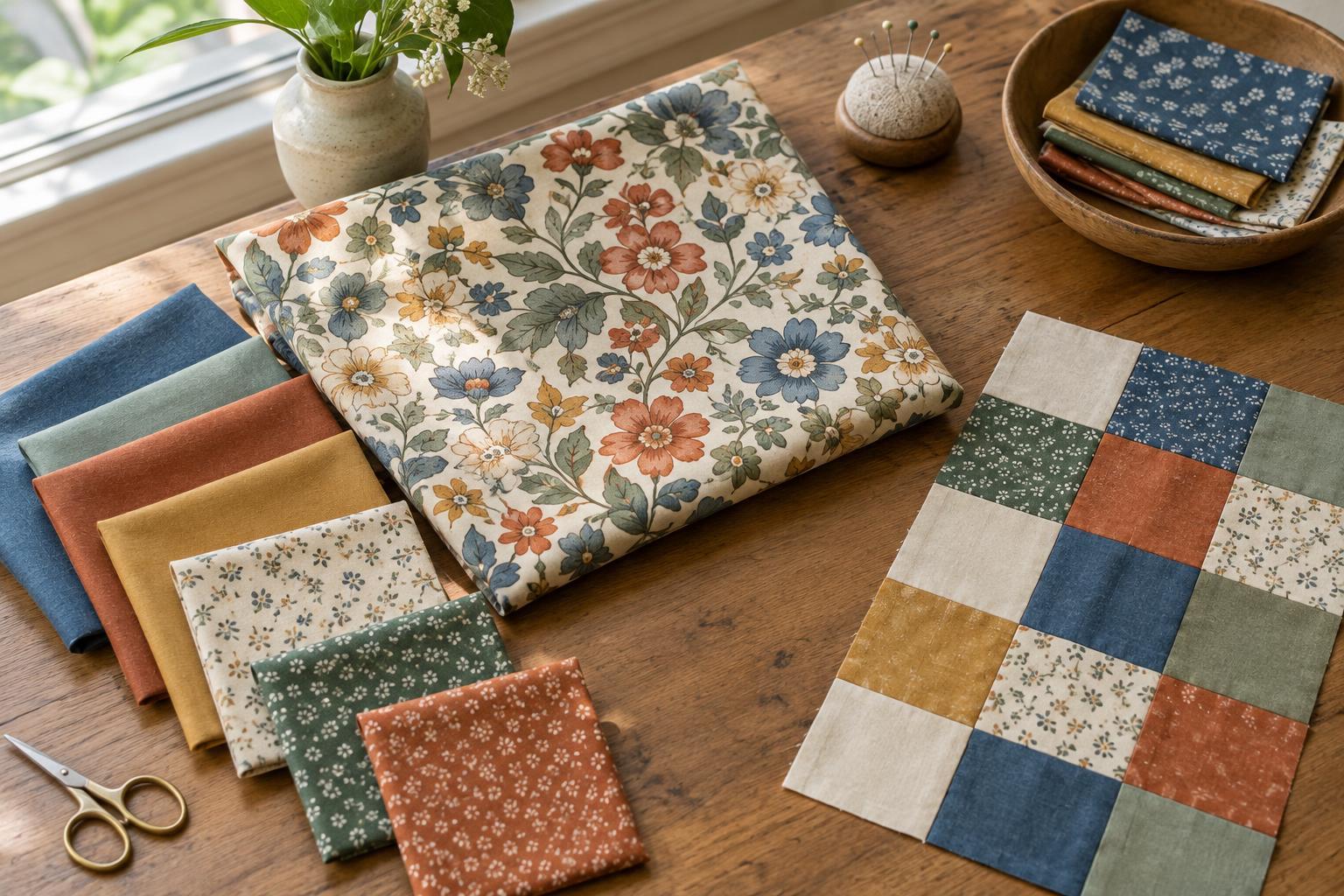
Before cutting, place your candidate fabrics side by side in good, even light. Arrange them from lightest to darkest, then compare fabrics that sit next to each other in the row. If two are difficult to order, they may be close enough in value to serve the same role. Try swapping one for a noticeably lighter or darker option where you need a crisp edge.
A photograph viewed in greyscale can help you notice value differences that colour distracts you from. It is a check, not a final verdict: the photograph, screen and lighting may change how the fabrics appear. Looking through a half-closed eye or stepping back from the fabrics offers another quick test. Use whichever method helps you see the overall shapes more clearly.
Prints deserve a second look. A small, evenly distributed print often reads as one general value from a distance. A large print with both pale and dark areas may behave differently depending on which part lands in each patch. If that variation matters to the design, set out the actual pieces, or use a paper window cut to the patch size to preview where the print will fall.
Plan placement before you cut everything
Make a small layout with your chosen fabrics, following the intended block arrangement. Look first at pairs of patches that touch: do their edges remain visible? Then look at the whole block: does the main shape appear? If the answer is no, changing one fabric may be enough. Replacing a medium background with a lighter one, for instance, may bring the surrounding shapes into focus without changing the colour palette.
You can also repeat a fabric’s value in several places to guide the eye. Dark corners might frame a block, while a run of light patches can form a diagonal path across multiple blocks. When laying out a whole quilt, check how neighbouring blocks meet. A strong pattern inside each block may produce a different pattern once the blocks are joined.
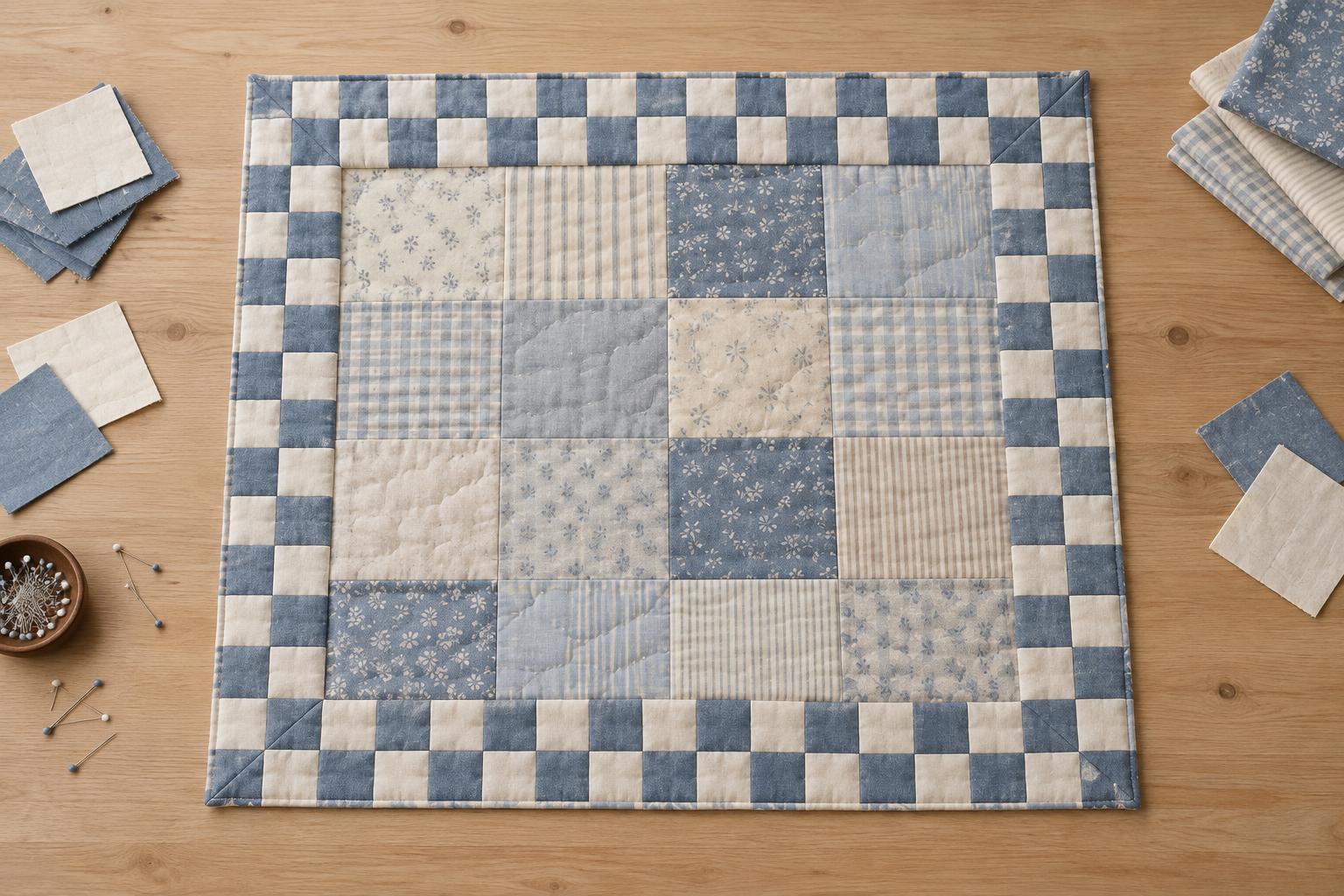
If you want a softer quilt, close values are not a mistake. Keep at least one area of clear contrast if you want a focal shape to remain visible, and let the quieter areas provide rest. A test block is especially useful when working with subtle differences: it shows how the fabrics behave after seams bring them together.
Use value as a design tool, not a rule
A light, medium and dark plan is a starting point for making decisions, not a requirement for every quilt. High contrast can make geometry bold; low contrast can make shapes blend gently. Both can work well. Choose the effect you want, test your fabrics at patch size and from a few steps away, and adjust the placement until the important parts of the block are easy to see.