Start with the feeling you want
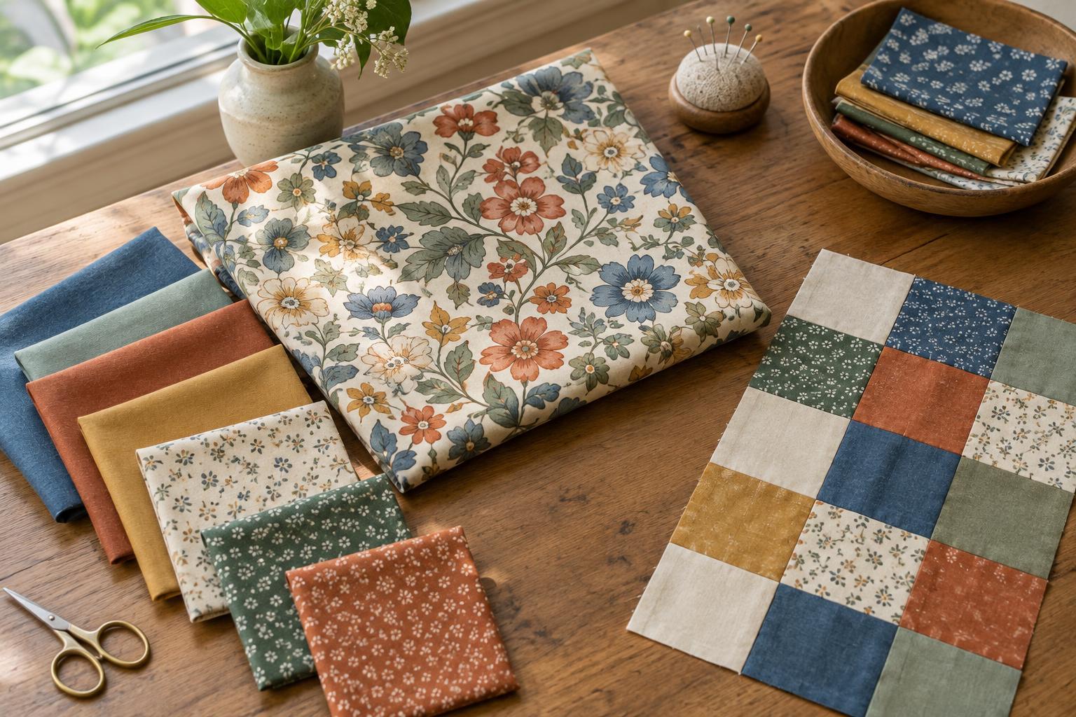
Warm colours, such as many reds, oranges and yellows, often feel lively and inviting. Cool colours, such as many blues, greens and violets, can feel quieter or more spacious. Combining the two gives a patchwork design contrast, but balance does not require equal amounts. A quilt with mostly cool fabric and a few warm accents can feel just as deliberate as one that gives both families similar space.
Choose a simple direction before cutting. For a restful quilt, you might use blue and green across most blocks, then repeat a small amount of coral in several places. For a brighter design, let rust or gold lead and use cool blue to separate warm areas. Think of these as starting points, not rules: a muted orange may seem gentler than an electric blue.
Judge each fabric in its company
Colour temperature is relative. A yellow-green may look warm beside a blue-green but cool beside an orange. Prints complicate the picture further: a cream fabric scattered with navy marks may read differently from a navy print with cream marks, even though both contain the same colours. Lay your candidates together rather than sorting every fabric into a fixed warm or cool pile.
Look at the fabric from a few steps away as well as up close. At a distance, small prints may blend into one apparent colour, while large motifs may create distinct patches. If a fabric is hard to classify, decide what job it does in the design. It might bridge the warm and cool groups, soften their boundary, or add a welcome bit of surprise.
Use proportion and placement to guide the eye
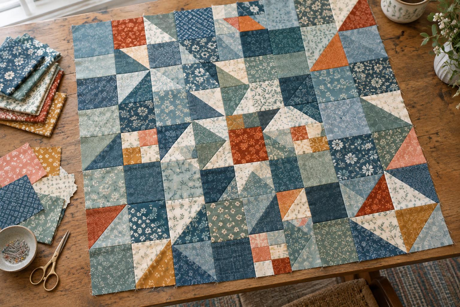
A useful first layout gives one colour family most of the visual space and the other a supporting role. Try placing your main family in larger pieces or more blocks, then repeat the supporting colour in smaller pieces across the quilt. Repetition helps an accent feel intentional. If one bright warm patch draws all the attention, adding that colour in two or three other areas may help the eye travel through the design.
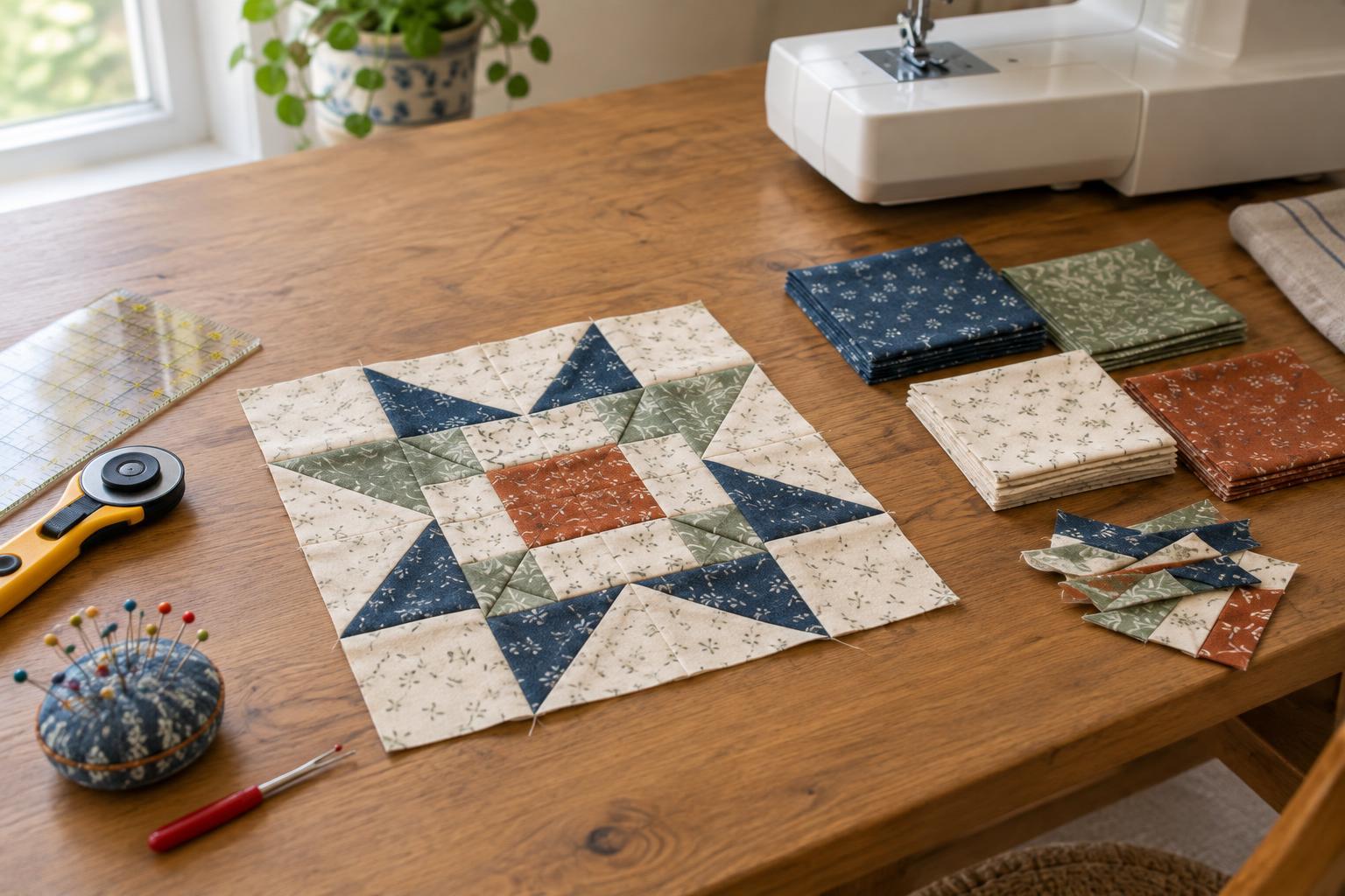
Placement matters as much as the fabric count. Warm pieces may appear to come forward when surrounded by cooler ones, especially if they are saturated or light. That makes them useful for block centres, stars or a loose path through the quilt. If you want a quieter surface, scatter warm and cool pieces more evenly, or group similar temperatures within blocks and alternate those blocks across the layout.
Check value before changing colours
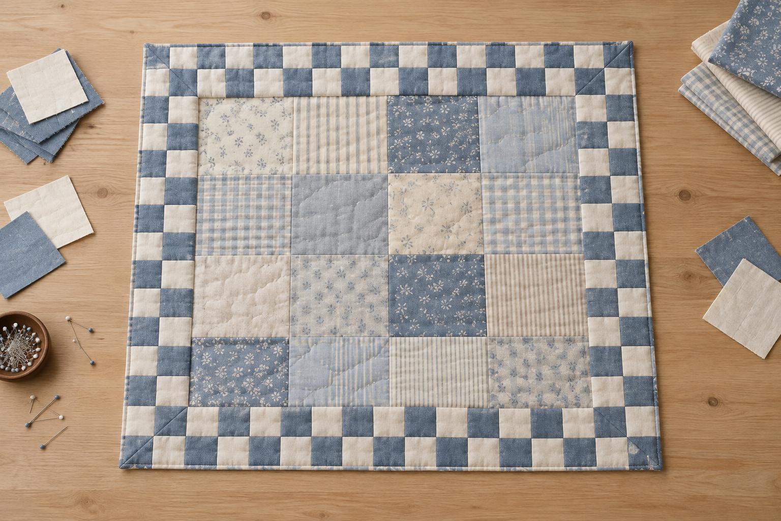
Value means how light or dark a fabric appears. Two fabrics can be beautifully different in temperature yet merge when sewn side by side if their values are similar. That can be helpful for a soft, blended look, but it may obscure a pieced shape you meant to show. Conversely, a pale cool fabric against a dark warm one can create a strong edge even when both colours are muted.
Before sewing, arrange a small selection in the order you plan to use it. Squint at the layout or view a photo in grayscale to see whether important shapes remain visible. Try moving a light or dark fabric rather than replacing an entire colour family. A neutral, such as cream, charcoal or a soft gray, can also provide breathing room, though neutrals may lean warm or cool themselves.
Test a small layout, then refine it
Make a few sample blocks or arrange cut-size fabric swatches on a table or design wall. View them in the light where you usually work, then check them in another part of the room if possible. Fabric colours can look different under different lighting. Take a photo before rearranging anything; comparing two layouts is easier when you do not have to rely on memory.
If the design feels too busy, reduce the number of competing prints or give one temperature more space. If it feels flat, introduce a clearer value difference or move a small accent to an area that needs attention. Keep the fabrics you enjoy, even if they do not fit a perfect formula. The aim is a layout whose colours support the patchwork shapes and feel satisfying to you.