Decide what the background needs to do
A background is more than the fabric left over after you choose your feature prints. It helps define the edges of blocks, creates space between motifs and sets the overall mood of a quilt. Before shopping or cutting, look at your pattern and ask what viewers should notice first. If the pieced shapes are the focus, the background should make their outlines easy to follow. If you want a softer, more blended design, it can sit closer in appearance to the other fabrics.
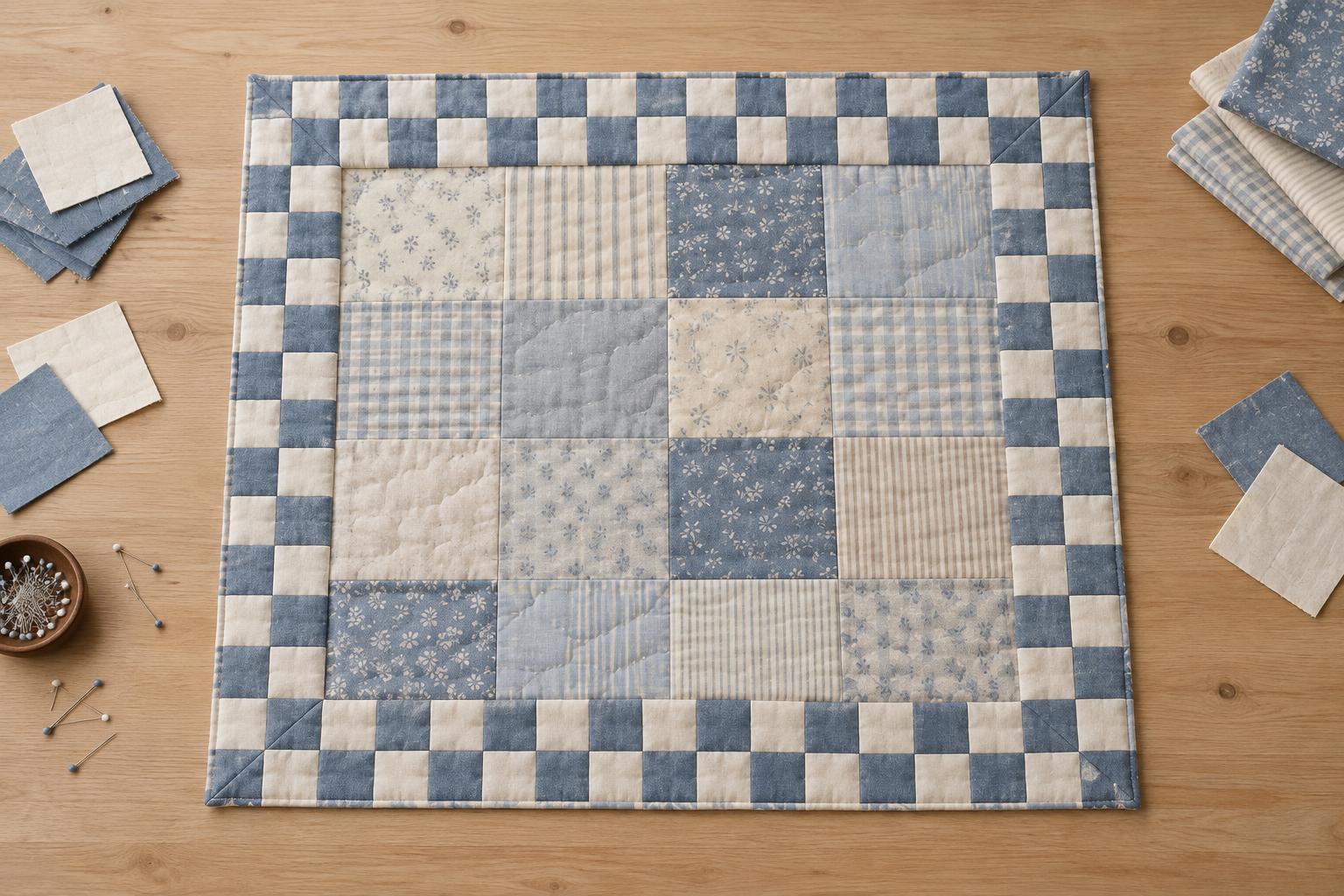
Consider how much background the quilt contains. A narrow strip between busy blocks has a different effect from large open areas around small motifs. In generous open spaces, even a subtle print becomes a prominent part of the design. You may also want those spaces to show quilting stitches clearly. There is no requirement to use white or cream: a background can be dark, colourful or pieced from several fabrics if it serves the design.
Check contrast before committing to a colour
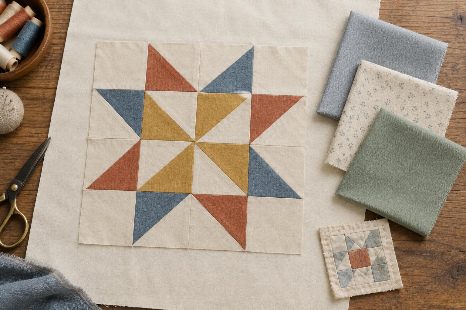
Value describes how light or dark a fabric appears. It often matters more than hue when you want patchwork shapes to read clearly. A pale blue star on a pale grey background, for example, may be harder to distinguish than the same star against a deep navy background. Lay candidate fabrics beside several of your lightest, darkest and most important patchwork pieces. Look from across the room as well as up close: a combination that seems distinct on the cutting table may merge at a distance.
A quick way to compare value is to photograph the fabrics and view the image in greyscale. This removes the distraction of colour and makes close values easier to spot. If pieces disappear but you want a crisp design, try a lighter or darker background. If the gentle transition is intentional, keep it. Watch for blocks containing both light and dark pieces; the best background may not contrast equally with every patch, but it should preserve the shapes that matter most.
Use colour to set the mood without stealing focus
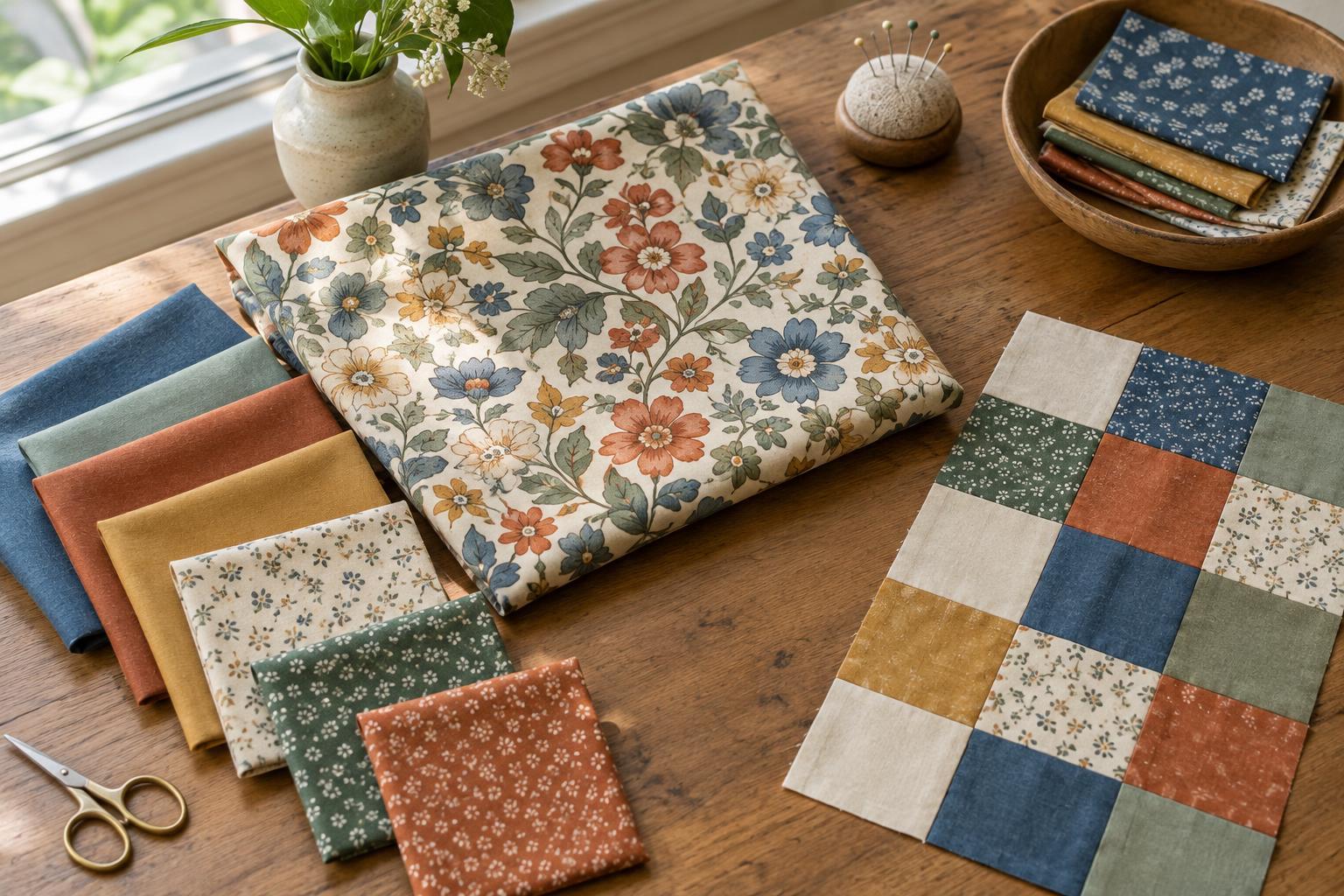
Background colour can connect a varied fabric collection. One approach is to choose a quiet colour already present in several prints. Another is to use a neutral that gives the palette space to breathe. Warm backgrounds such as ivory or soft tan can make a quilt feel different from cool greys or blue-tinted whites, even when both appear light. Place the options directly against your project fabrics rather than judging them separately.
Also compare colour intensity. A vivid background may compete with equally vivid blocks, while a muted version of the same hue may let them stand out. Dark backgrounds can make bright patches feel lively, but check whether the darkest pieces lose their edges. When using several backgrounds for a scrappy look, aim for a deliberate range: fabrics can vary in hue while remaining reasonably consistent in value, or vary in value to create an intentionally shifting surface.
Match print scale and fabric behaviour to the pattern
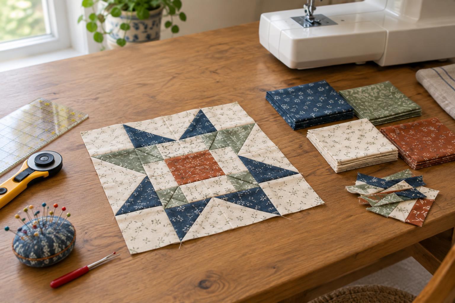
Solid fabric is not the only quiet option. Tone-on-tone prints, tiny scattered motifs and low-contrast textures can add interest without interrupting block outlines. To judge a print, place it behind a few completed or mock-up units and step back. A motif that looks small on the bolt can become noticeable across a large quilt; a directional print may also require extra attention during cutting if you want its lines to run consistently.
Think about how the fabric will behave beside the rest of the quilt. Fabrics with noticeably different weight or stretch can be harder to piece together evenly. Check that a pale background does not show dark seam allowances or strong prints through its surface in a way you dislike. If you plan to use the same background throughout, buying enough for the pattern's cutting needs and a modest allowance for errors helps you avoid an unwanted change midway through.
Make a small test, then make the choice
Before cutting all the background pieces, arrange a small group of patches on each candidate fabric. Include the fabrics most likely to disappear: usually your lightest pieces against a light background, or your darkest pieces against a dark one. If possible, sew one sample block. Seams change the amount of fabric visible, so a finished sample often gives a truer impression than loose pieces alone.
View the sample in the kind of light where the quilt will usually be seen, and leave it out long enough to notice what draws your eye first. Ask whether the background supports the main shapes, whether its print feels calm at a distance and whether you enjoy the overall colour balance. Keep the option that best serves your intended effect, not simply the one that looks most interesting by itself. A successful background makes the patchwork feel like a considered whole.