Choose a simple thread to connect the scraps
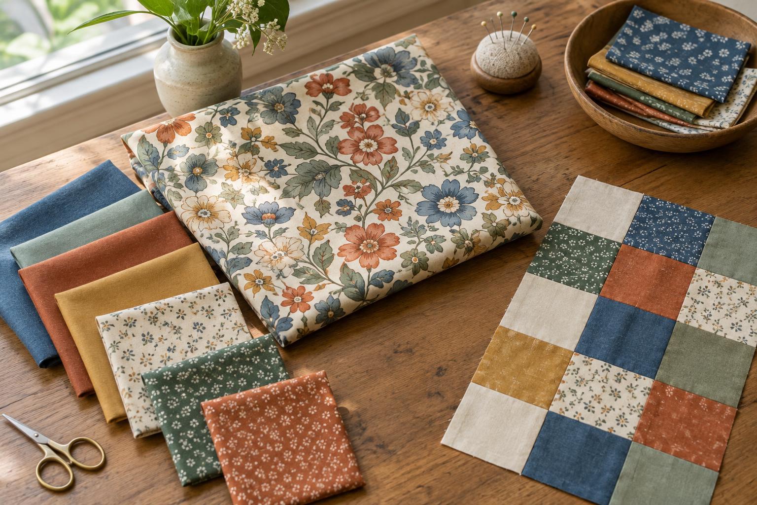
A cohesive scrappy quilt does not need matching fabrics. It needs a few choices that repeat often enough for the eye to recognise them. Before cutting, spread out the scraps you hope to use and look for a shared feature: a colour that appears in several prints, a similar mood, or a group of warm or cool tones. Let that feature guide your selection rather than trying to make every piece coordinate with every other piece.
A small colour plan can help. You might use blues and greens as the main colours, add a little yellow for contrast, and let cream appear throughout the quilt. Other scraps can still join in, but limiting the most prominent colours gives the design a starting point. If a fabric feels out of place, try using it more than once. A lone orange patch may draw attention; a few orange patches placed around the quilt can look intentional.
Balance light, medium and dark fabrics
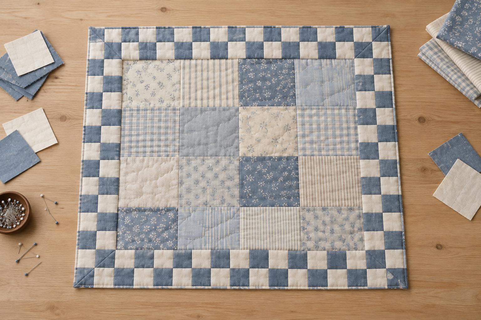
Colour is only part of the picture. Value describes how light or dark a fabric appears, and it helps define the shapes in a patchwork design. A collection of beautiful prints can blur together if they all have similar values. Conversely, a few dark pieces gathered in one corner may pull attention away from the rest of the quilt.
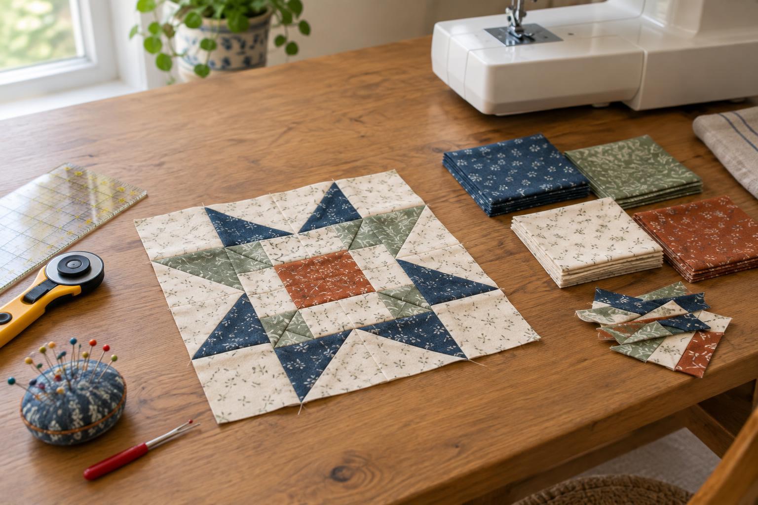
Sort your scraps loosely into light, medium and dark groups. Then decide what the pattern needs. A block with a clear star or diagonal path may depend on contrast between its pieces. A more relaxed layout can use subtle value changes, provided the overall spread feels balanced. Step back from your arrangement or look at a photo in greyscale to check where the strongest light and dark areas fall. If one area dominates unexpectedly, exchange a few pieces before sewing.
Vary print scale while repeating visual anchors
Print scale is the size of the motifs on a fabric. A mix of small prints, larger designs and quieter fabrics gives the eye places to rest. If every patch has a bold, busy print, the quilt may feel crowded even when its colours work well together. Small dots, subtle stripes and nearly solid fabrics can act as bridges between more expressive pieces.
Repeating an anchor fabric is another way to create rhythm. It could be one cream print used in several blocks, a dark navy that appears across the quilt, or a consistent fabric for the sashing. You do not need enough of the anchor for every block. Even occasional appearances can help connect different groups of scraps. Before cutting a large-scale print, check what will remain visible in the finished patch size; a tiny square may show only an unrecognisable fragment of the design.
Let the layout do some of the work
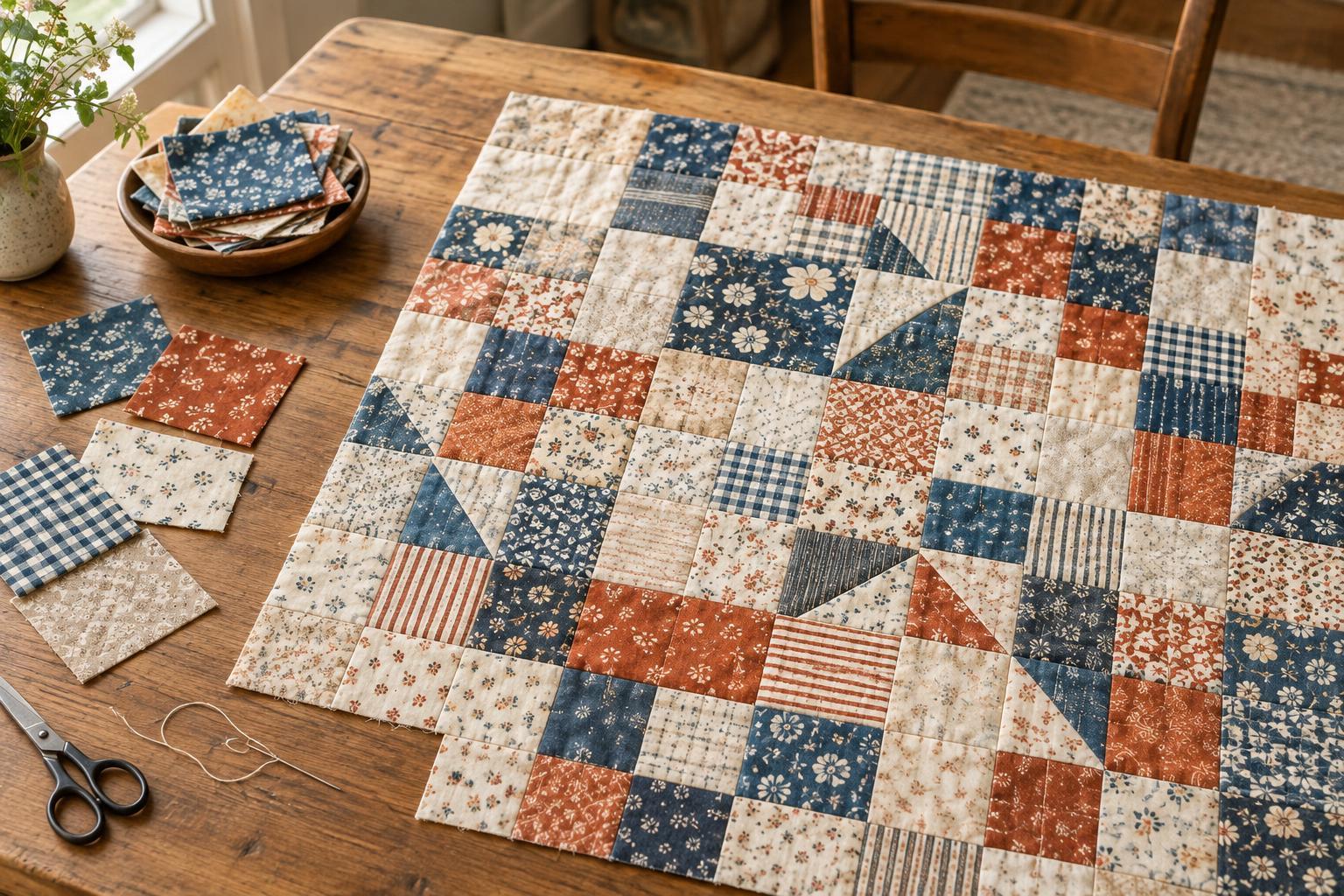
Once you have cut your pieces, arrange blocks or patches before joining them. Look for clusters of the same colour, repeated prints sitting next to each other, and areas that feel much busier than their neighbours. Move pieces around until the contrasts travel across the quilt rather than collecting in one spot. This is especially useful when sewing from a varied scrap collection: the fabrics may look balanced in a pile but behave differently when placed side by side.
Structure can also provide cohesion. Using the same block shape throughout, keeping a consistent background, or placing each block in the same orientation creates order around assorted fabrics. If you prefer a lively layout, leave some surprises in place. The aim is not perfect symmetry; it is a distribution that lets the viewer notice both the individual scraps and the quilt as a whole.
Check practical details before committing
Appearance matters, but so does how the fabrics sew together. Scraps with very different weights or stretch can make accurate piecing harder. Set aside fabrics that feel unusually slippery, stiff or loosely woven unless you have a plan for handling them. If the scraps come from different sources, decide how you will approach washing before assembly and be consistent where possible. Testing a small piece can help when you are unsure whether a fabric may bleed colour or change noticeably after washing.
Make a sample block if the project is large or the colour combination feels uncertain. It can reveal whether the intended contrast survives at block size and whether your seam allowances are working with the chosen fabrics. Then keep the rest of the process flexible. A scrappy quilt often becomes more interesting as you respond to what is on the design surface, repeating the choices that work and adjusting those that do not.