Start with the effect you want
A quilt does not need equal amounts of solids and prints. The right mix depends on what you want people to notice first. If the patchwork shapes are the main attraction, solids or quiet prints can make their edges easy to read. If you want the surface to feel lively and layered, prints can take a larger role. Neither approach is better; each gives the same block a different character.
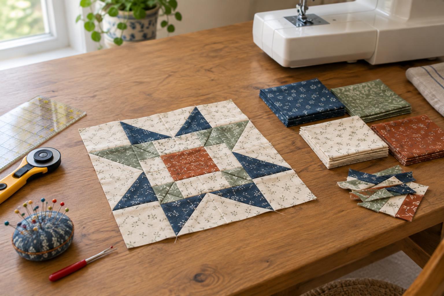
Before choosing yardage, describe the quilt in a few words, such as calm, playful or bold. Then identify its focal point. A star block, for example, may stand out against a restrained background but compete with it if every surrounding piece has a busy pattern. This simple decision gives you a way to judge fabrics beyond whether you like them individually.
Give solids and prints distinct jobs
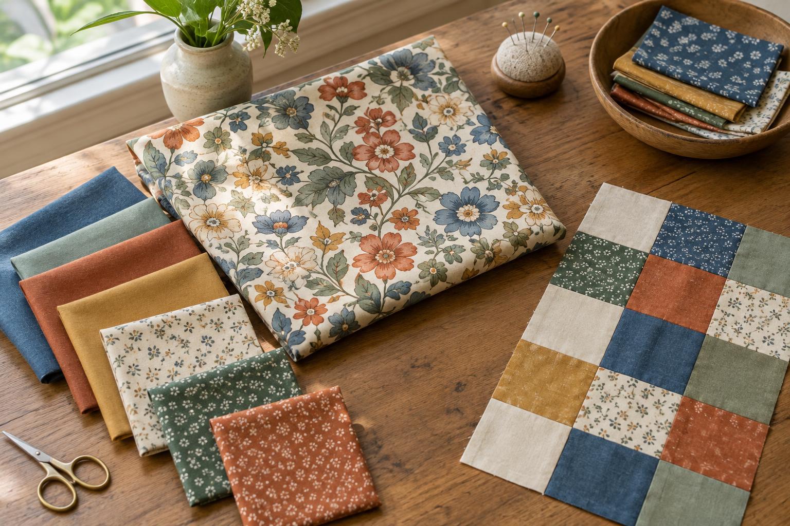
Solids provide areas of uninterrupted colour. They can separate busy patches, define a shape or make a small accent especially noticeable. Prints introduce variation within each piece and can help a quilt feel connected when their colours appear elsewhere in the design. A print with a subtle texture may behave almost like a solid from across the room, while a large floral may become a focal point of its own.
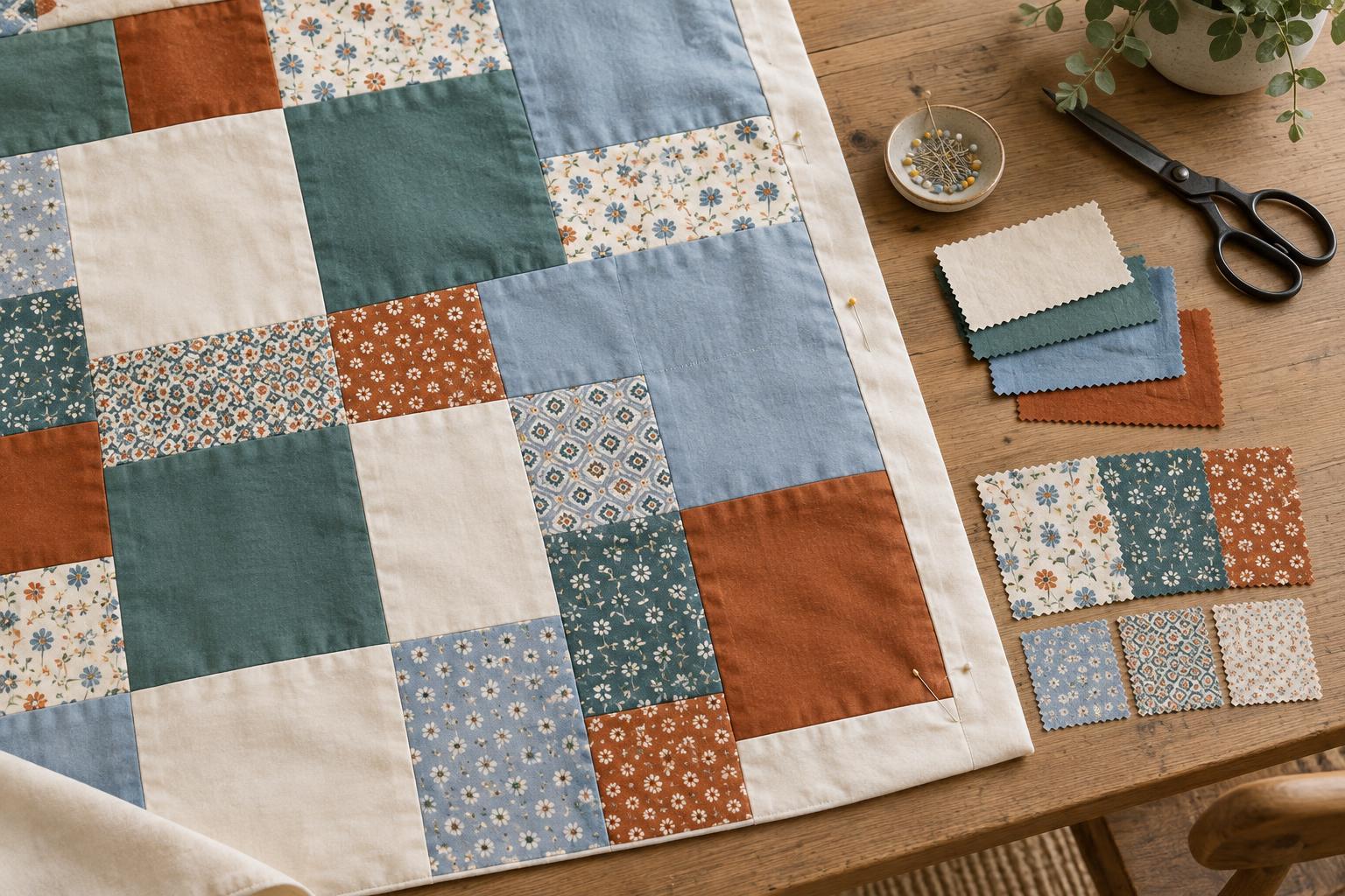
Try assigning jobs before settling on a mix. You might use a solid for the background, medium-scale prints for the main blocks and one vivid fabric for occasional accents. Or reverse the idea: place solid shapes on a printed background. Keeping one role consistent across the quilt often creates order even when you use many different fabrics. If everything seems equally prominent, change the role of a few fabrics rather than replacing the whole selection.
Balance value as well as colour
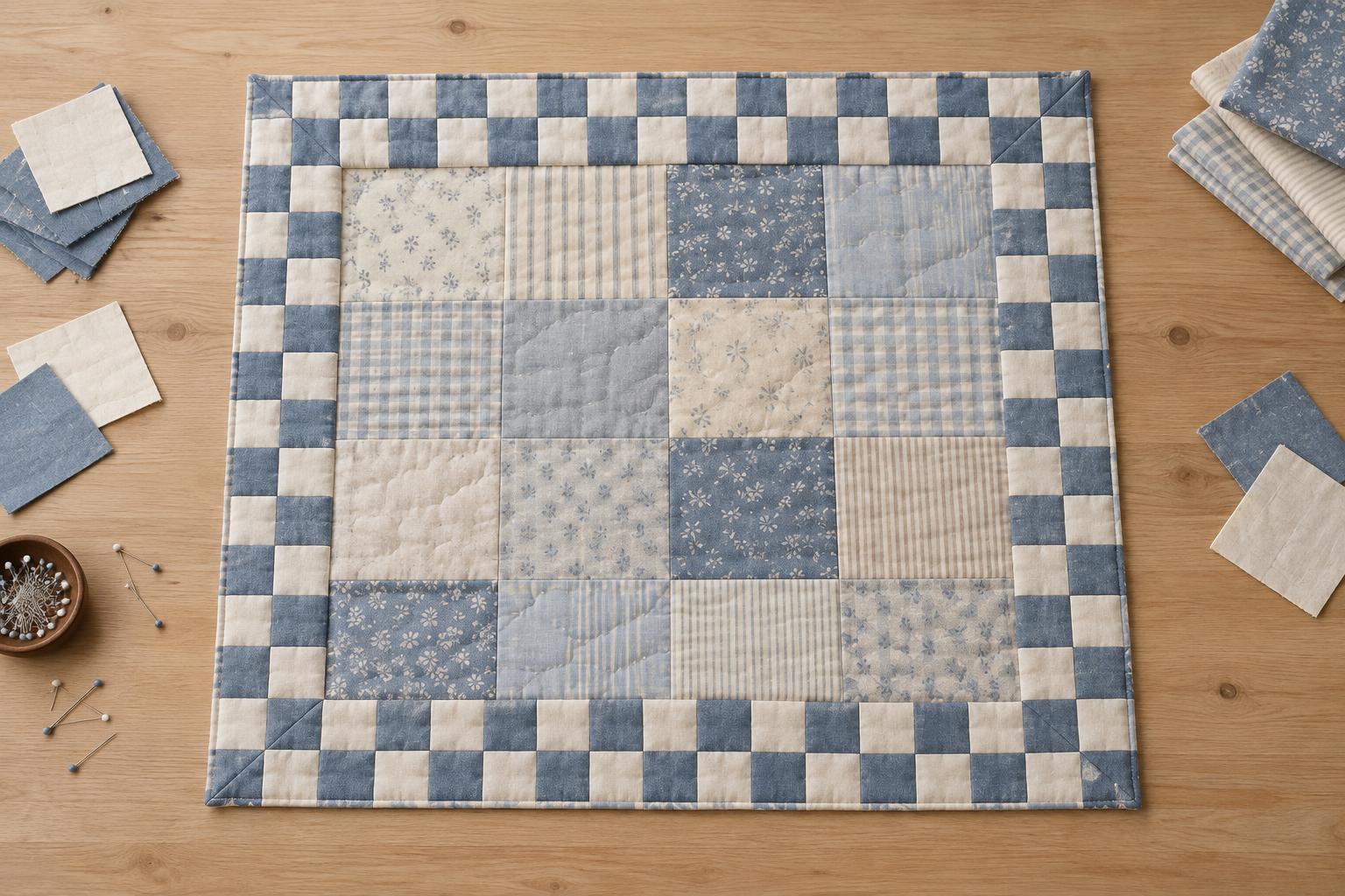
Colour names alone will not tell you whether a patchwork design is clear. Value describes how light or dark a fabric appears. A pale blue solid and a pale yellow print may look different up close but merge in a block that relies on strong contrast. Conversely, a dark print can provide a firm outline even when it contains several colours.
Lay your candidates side by side and step back. Look for places where the intended shapes disappear or where an unexpected piece demands attention. A photo viewed in grayscale can also help you compare light and dark areas without being distracted by hue. This is a design check, not a rule: gentle contrast is useful when you want a soft, blended quilt. What matters is whether the result matches your intention.
Vary print scale without creating clutter
Print scale is the size of a fabric’s motifs. Several large, high-contrast prints placed together can make a block feel crowded, particularly when the cut pieces are small. Mixing large motifs with smaller patterns, subtle textures and solids gives the eye places to rest. A large print may work beautifully in a wide border or generous square, yet lose much of its design when cut into narrow triangles.
Consider where seam lines will interrupt each motif. If a fabric has a distinctive flower or figure, preview it through a paper window the size of the finished patch. This shows what will remain visible after cutting and sewing. Directional prints need another check: stripes, words or other one-way motifs may point in different directions across a block. That can be charming, but it is easier to decide before cutting.
Test a small arrangement before committing
Gather a little more variety than you expect to use, then arrange a sample block or several fabric pieces in the approximate layout. View them close up and from across the room. If a solid looks flat beside the prints, try one with a different value or use a quiet, textured-looking print in its place. If the arrangement feels too busy, increase the space given to a background fabric or reduce the number of competing focal prints.
Check your choices in the light where you usually sew, and revisit them after a break. Fabric colours can appear different under different lighting, while a fresh look often makes an imbalance easier to spot. Once you find a combination you like, keep a small note of which fabrics serve as background, main shapes and accents. That guide can help you maintain the balance as the quilt grows without making every block identical.