What saturation adds to a quilt
Saturation describes how vivid or muted a colour appears. A saturated blue may look clear and lively, while a less saturated blue may look smoky or greyed. Both can belong to the same blue palette. This gives you a way to change a quilt’s energy without introducing a new hue.
A small area of vivid fabric often catches the eye when its surroundings are quieter. In patchwork, that can help establish a focal block, draw attention to a repeated shape or lead the eye across the quilt. The effect depends on context: a bright print surrounded by other bright prints may not stand out at all.
Saturation is not the same as value, which describes how light or dark a fabric appears. A pale colour can be vivid, and a dark colour can be muted. Because value also affects whether shapes are easy to distinguish, consider both when choosing fabrics for a block.
Start with the palette you already have
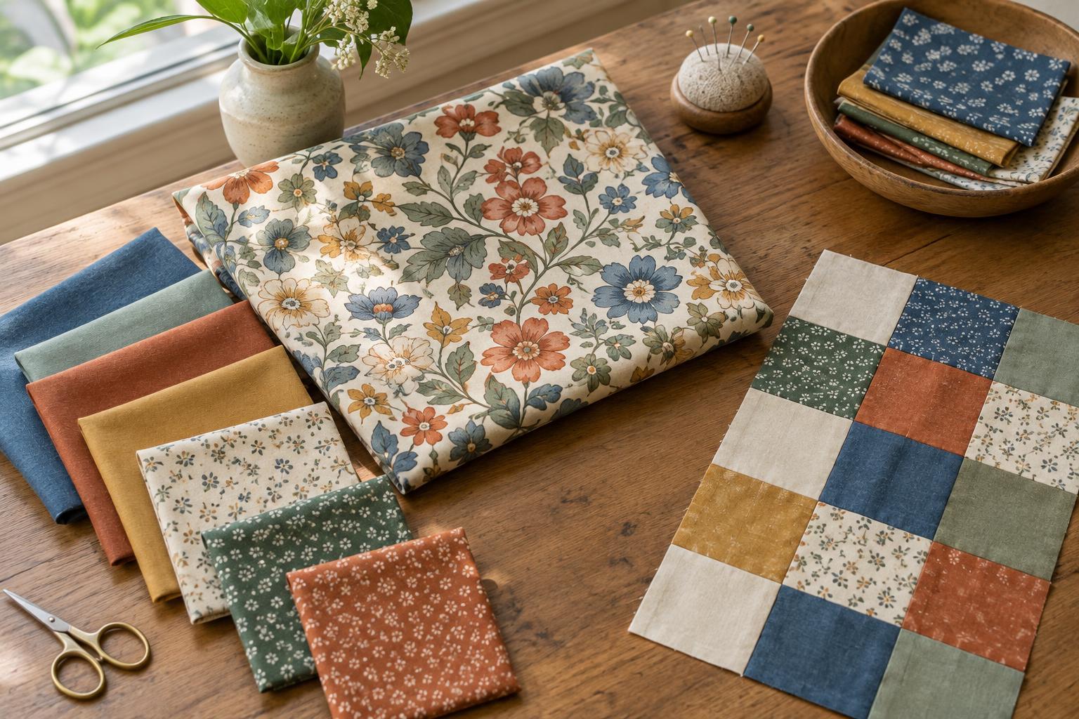
Lay out the fabrics you intend to use and group them by colour family. Within each group, look for a range from muted to vivid. You might have dusty, medium and clear blues, for example, alongside soft and strong rust tones. You do not need every colour family to contain a perfect range; even a few well-placed differences can create emphasis.
Choose one job for the most saturated fabrics before cutting. They might mark the centres of a set of blocks, form the points of stars or appear at regular intervals in a border. Give the quieter fabrics the supporting roles around them. This makes the vivid pieces look intentional rather than scattered wherever there was room.
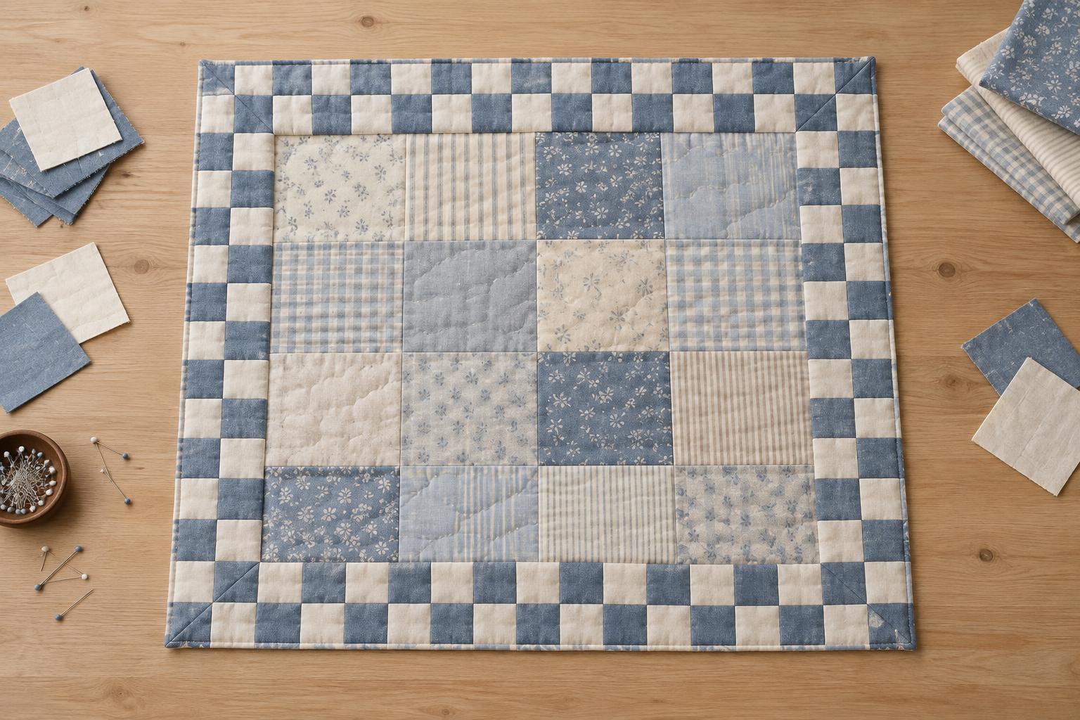
If your palette includes cream, white, grey or another near-neutral, treat those fabrics as space around the colours rather than trying to rank them by saturation. Their lightness, warmth and print can still change how vivid the neighbouring fabrics appear.
Make emphasis through placement
For a simple test, imagine a quilt built from repeated nine-patch blocks in blue, rust and cream. Use muted blues and rusts across most of the blocks, then place clearer versions of those same colours in the centre squares of a few blocks. The colours remain familiar, but those selected blocks gain a stronger presence. Moving the vivid centres into a diagonal or loose cluster changes the path your eye follows without changing the palette.
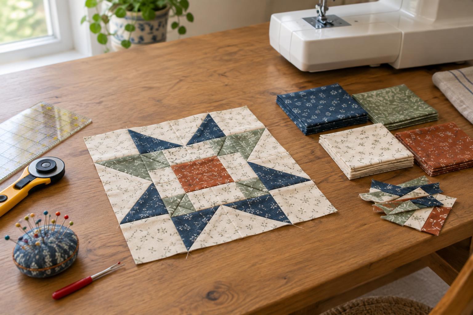
You can also use saturation to clarify a shape. In a block with many small pieces, reserve the most vivid fabrics for the parts you want to read first, such as the points of a star. Keep neighbouring pieces quieter so the points have room to stand out. If every small piece is equally intense, the block may feel busy rather than focused.
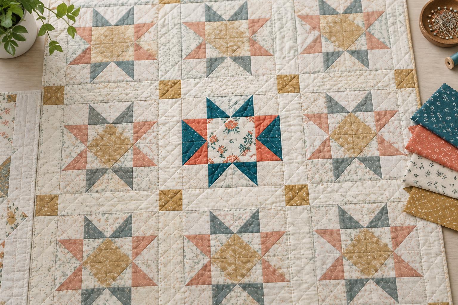
Repeat vivid fabrics sparingly outside the focal area if the design feels disconnected. A few smaller echoes can link the emphasis to the rest of the quilt. Aim for a rhythm that suits the project, not an exact formula: a bold central motif may need very little repetition, while an all-over design may benefit from vivid pieces appearing in several places.
Check prints, value and scale together
Printed fabric can make saturation harder to judge. A print with one bright colour on a muted ground may look quiet from across the room but lively up close. Set candidate fabrics beside the actual fabrics they will touch, then step back and look again. A phone photo of the layout can also help you notice which pieces attract attention first, though screen colours may not match the cloth exactly.
Check value separately by viewing the fabrics in greyscale or squinting at the layout. If two pieces blend together in value, a difference in saturation may not be enough to define a seam or motif. Conversely, a dark muted fabric can draw attention because of its value even when it is not especially vivid. Adjust placement according to the shapes you want the viewer to see.
Scale matters too. A large area of vivid fabric can dominate several small accents. If a candidate fabric feels overpowering, try it in smaller pieces or place a quieter print beside it. Mocking up one block before cutting the whole quilt is often more useful than judging isolated swatches.
Edit the layout before you sew
Once the blocks are arranged, ask where your eye lands first and where it travels next. If attention stops in an unintended corner, swap one vivid piece for a muted version from the same colour family. If the intended focal area feels weak, bring a clearer fabric closer to it or quieten the pieces around it. Make one change at a time so you can see what each swap does.
Keep any leftover vivid fabric available while assembling the quilt, but resist adding it simply to use it up. Saturation works best as a choice about emphasis, not a requirement to distribute every fabric evenly. By giving vivid and muted versions of your palette different roles, you can create a quilt with direction and variety while keeping its colours cohesive.