Start with a fabric, not a perfect formula
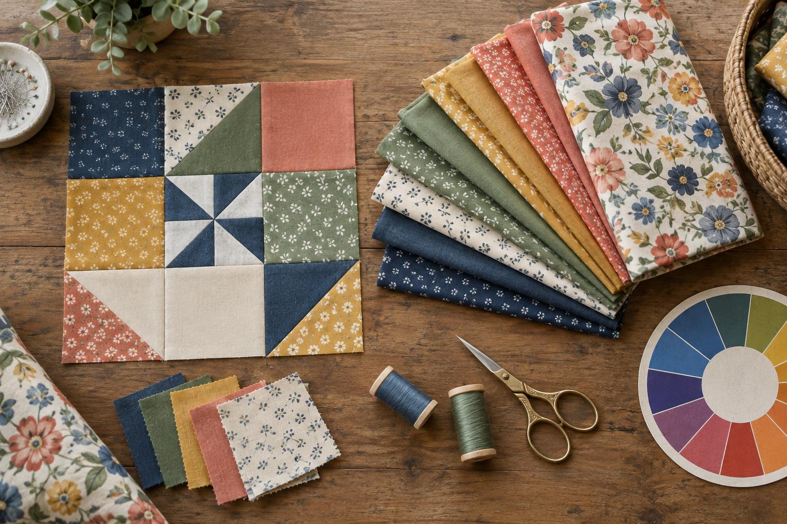
A colour wheel shows how hues relate to one another. Neighbouring colours can create a gentle progression, while colours across the wheel can create contrast. For a quilt, though, the wheel is a starting point rather than a set of rules. Real fabrics contain prints, shadows and several colours at once.
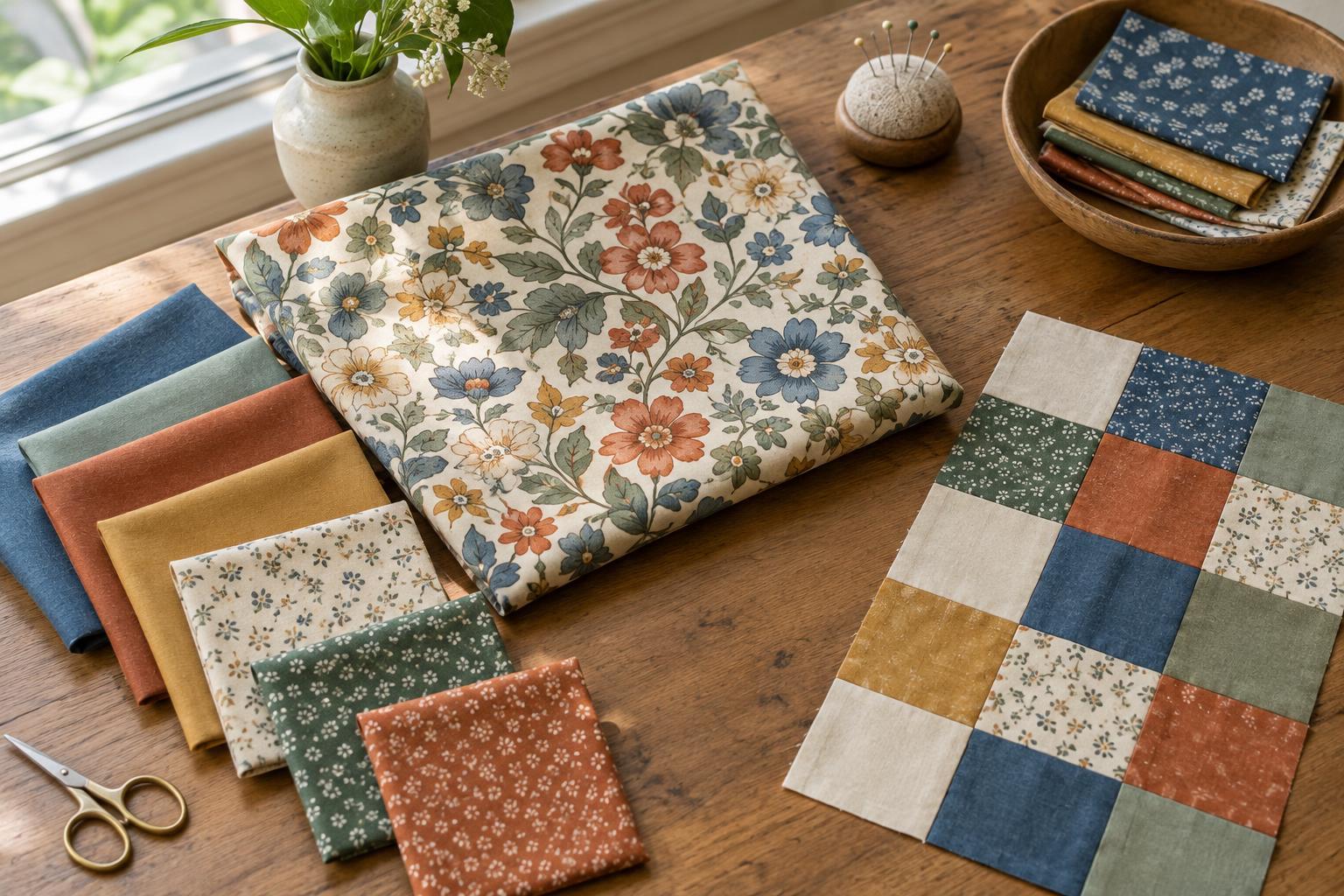
Choose one fabric you would enjoy seeing throughout the quilt. It might be a floral, a stripe or a nearly solid fabric. Look closely and name its main colour, one supporting colour and any small accent that catches your eye. Those colours can become the basis of your palette. Keeping the inspiration fabric beside you as you choose other fabrics makes it easier to judge whether each addition belongs.
Choose a colour relationship that suits the quilt
For a calm palette, try analogous colours: hues that sit near each other on the wheel, such as blue, blue-green and green. You can use several fabrics within each hue, from pale to deep, without making every piece an exact match. This approach works well when you want the patchwork shapes and fabric textures to share attention.
For more energy, try a complementary pair: colours on opposite sides of the wheel, such as blue and orange. They do not need equal space. You might use a range of blues for most of the quilt and reserve orange for a few small pieces. If the contrast feels too strong, choose a softer, greyer version of one colour or let a neutral fabric separate them.
A third option is to choose one hue and vary its lightness and intensity. A collection of pale, clear and muted greens can feel coordinated while still offering variety. Whatever relationship you choose, limit the first selection to a manageable group of fabrics. You can add more once you see what the design needs.
Check value before adding more colour
Value describes how light or dark a fabric appears. It matters because two fabrics with different hues may still look nearly identical from a distance. If neighbouring patchwork pieces are meant to stand apart, they usually need enough value contrast to make their edges visible.
Lay your choices together and step back. Squinting can help you notice whether light, medium and dark areas are distinct. A phone photograph viewed in greyscale can offer another useful check, although the result may not capture every detail of the fabric. If the layout looks flat, try swapping one medium fabric for a lighter or darker choice before buying or cutting more.
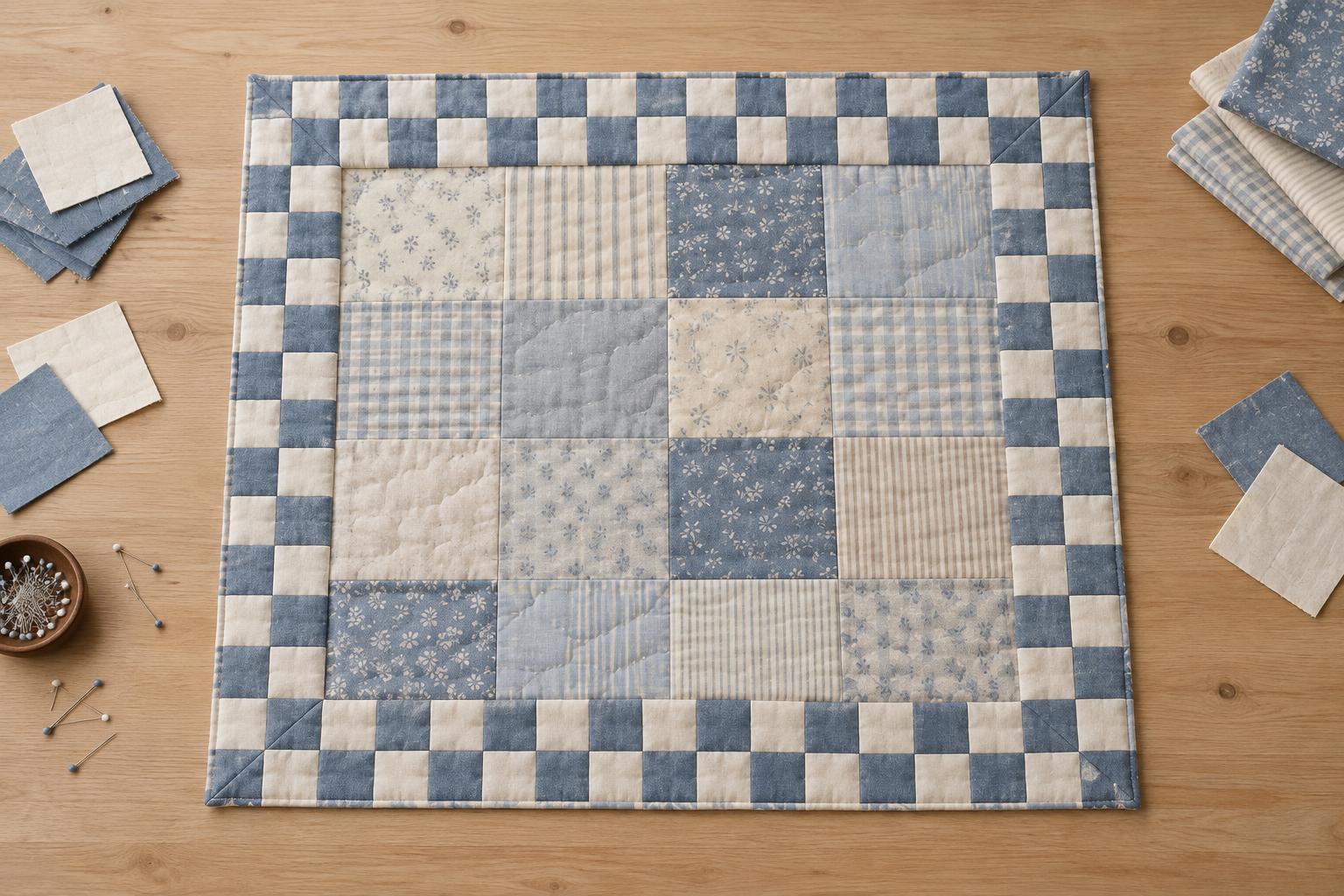
You can also use similar values deliberately. Closely matched fabrics can soften the boundary between pieces and give a quilt a quieter appearance. The important question is whether the contrast supports your intended design.
Let prints, intensity and neutrals do their jobs
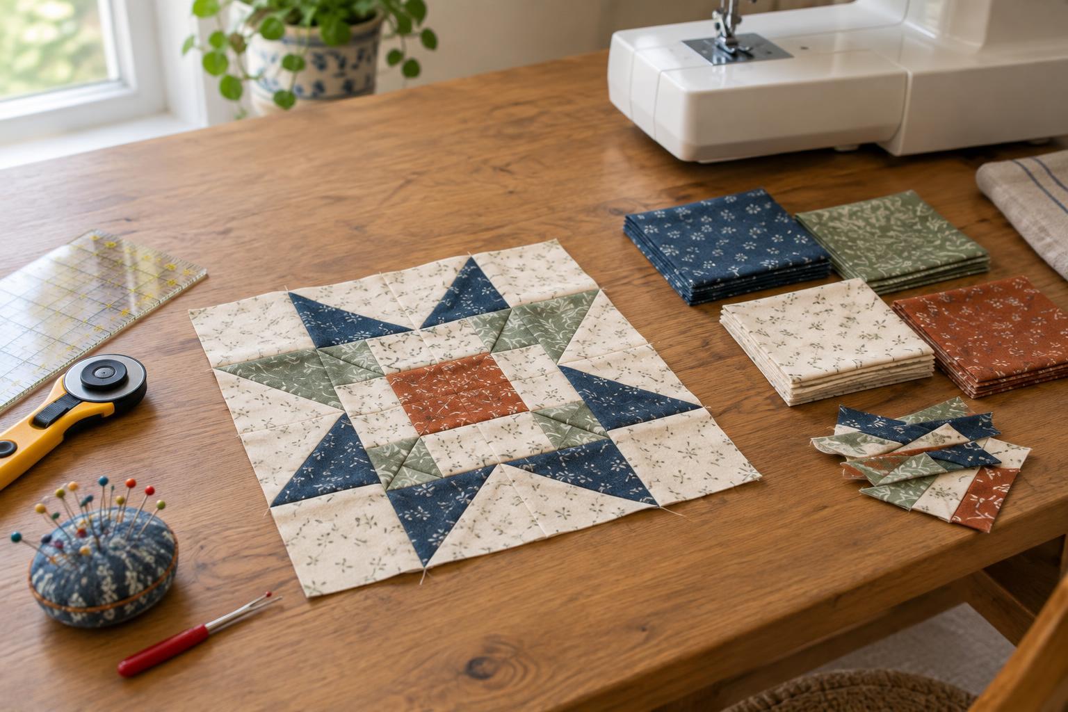
Print scale changes how a palette reads. A large multicolour print can act as the focus, while small prints, subtle textures and near-solids give the eye places to rest. If every fabric has a bold pattern, it may be harder to see the block construction. Try mixing print sizes and checking how each fabric looks both close up and from across the room.
Intensity matters too. Bright, clear colours tend to draw attention, so even a small piece can become a focal point. Muted colours often sit more quietly beside them. Rather than making all your fabrics equally vivid, decide where you want the viewer to look and place your strongest colour there.
Cream, grey, brown and other low-key fabrics can provide space between stronger colours, but they are not automatically interchangeable. A warm cream may feel more at home with earthy reds than a cool white does. Compare possible neutrals directly with your chosen fabrics instead of selecting them by name alone.
Test the palette in a small layout
Before cutting a whole quilt, arrange a few fabric pieces in the approximate proportions you plan to use. If one colour will cover most of the quilt, give it most of the space in your test. Move accent fabrics around and notice whether your eye travels through the layout or stops in one unintended spot.
You do not need a complete block to learn from the test. Small squares or folded fabric edges are enough to reveal a colour that feels out of place, a missing dark value or an accent that needs repeating. Make one change at a time so you can tell what improved the balance.
A coordinated palette does not require every fabric to match perfectly. It needs a clear idea, enough contrast for the pattern and a distribution of colour that feels right to you. The colour wheel helps you begin; arranging the actual fabrics helps you finish the decision.