Light is part of every fabric choice
You may choose a blue print at the cutting table, bring it home, and find that it looks almost grey in your sewing room. The fabric has not changed. What has changed is the light reaching it. Fabric absorbs some parts of the light that falls on it and reflects others toward your eyes. When the available light changes, the colour you see can change too.
Daylight is not one fixed condition: a bright window, an overcast sky and late-afternoon sun can make the same fabric look different. Indoor bulbs also vary. Some give a warmer, yellowish impression, while others appear cooler. This matters most when you are choosing several fabrics that need to work together, rather than judging one piece on its own.
Why two fabrics can change differently
Different dyes and printed colours do not always react to a change in lighting in the same way. Two fabrics might seem to match beside a window but separate under a lamp. A cream that looked close to a white background may suddenly appear yellow, or a purple print may look bluer than its neighbour. This effect is sometimes called metamerism: colours that appear similar in one light can appear different in another.
Surface matters as well. A smooth, tightly woven cotton may reflect light differently from a textured linen blend. Prints add another layer: tiny marks that seem to blend into one colour from a distance can become more noticeable in brighter light. Before rejecting a fabric because it looks wrong, check whether the shift comes from its colour, its texture or the print you are seeing.
Test a palette where the quilt will be used
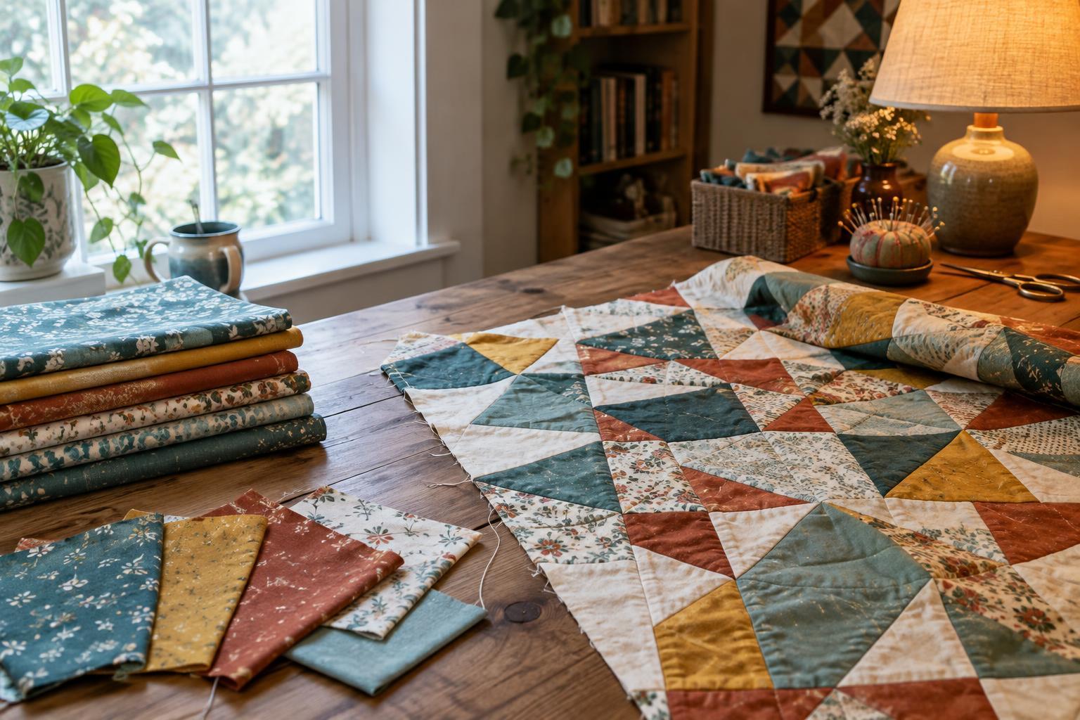
If you can, look at your fabric choices in more than one place before cutting. Arrange them near a window in indirect daylight, then check them under the light you normally use for sewing. If the quilt is intended for a room with lamps, view the selection there too. You do not need special equipment: moving a small stack of fabrics between rooms can reveal a surprising difference.
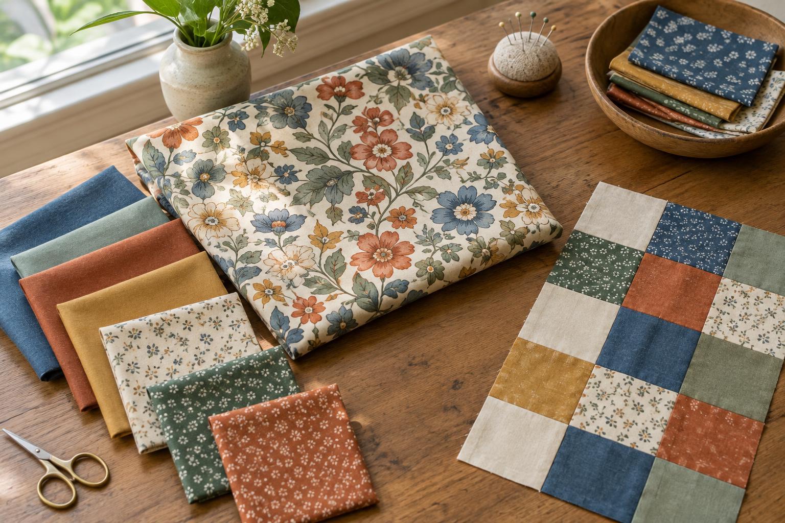
Keep the pieces together when you move them. A colour may look pleasing by itself yet compete with its neighbours when the group is laid out. Place likely fabrics next to one another, not just in a pile, and step back far enough to see the overall pattern. If possible, check larger pieces or repeated blocks; a small swatch may not show how strongly a print will read across a whole quilt.
Check value and contrast, not just hue
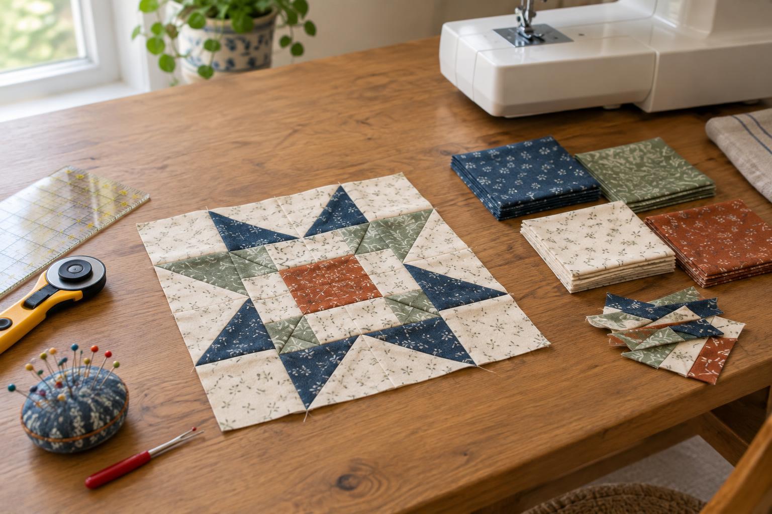
Lighting can change how clearly the parts of a quilt stand apart. In a star block, for example, the points need enough contrast with the background to keep their shape visible. Two fabrics can have different hues but a similar lightness, causing the points to disappear when you step back. A darker room may make an already subtle distinction harder to notice.
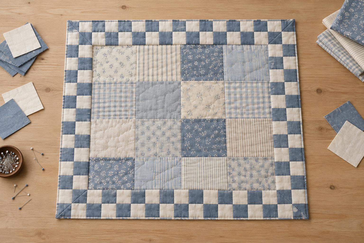
Try photographing a tentative layout and viewing the image in greyscale as one way to compare light and dark areas. It is a useful check, though a screen and camera can alter appearances, so return to the actual fabrics before deciding. Squinting at the layout or looking at it from across the room can also help you judge whether the block design remains clear.
Choose a reliable way to make the final call
When two fabrics only work together in one particular light, decide whether that is enough for your project. A wall hanging intended for a specific room may reasonably be planned around that room’s lighting. For a quilt that will travel between rooms or be given as a gift, a combination that remains pleasing under both daylight and indoor light may feel more dependable.
You do not have to eliminate every shift in colour. Small changes can make a quilt interesting as the light moves through the day. The useful habit is to notice them before cutting: compare your fabrics together, check the contrast in your blocks, and look under the conditions in which the finished quilt is likely to be seen. Then choose the palette you enjoy, knowing how it behaves beyond the cutting table.